
My Role
Product Design
Brand Design
Product Design
Brand Design
Product Strategy Jackson Latka
Development Matt Staff
Development Matt Staff
Proof of concept
Spokata’s mission is to make text-based news and information universally accessible as real-time audio. The goal for the web app was to demonstrate this technology, in order to attract media partnerships.
Solution
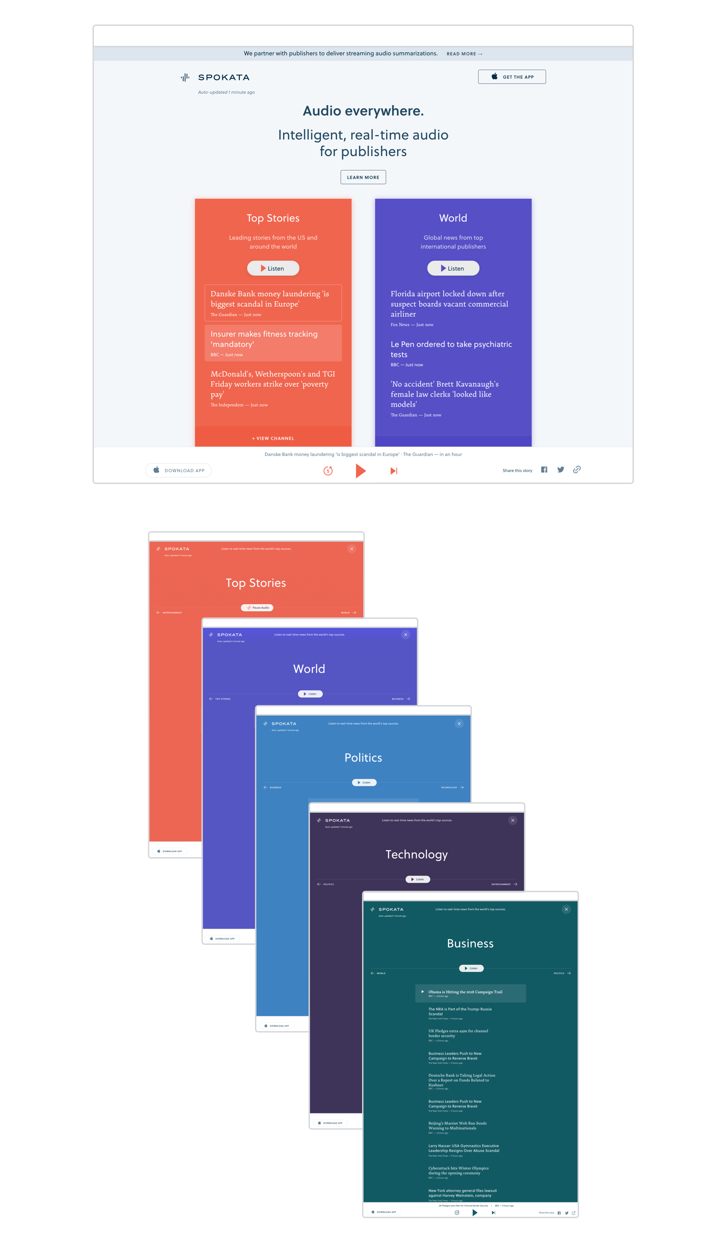
We designed the web experience as a news aggregate you listen to — with playlists of news stories, organized into topical sections from trusted sources like The BBC, The New York Times, Fast Company, and more.
386 artboards titled ‘Desktop Copy 2’
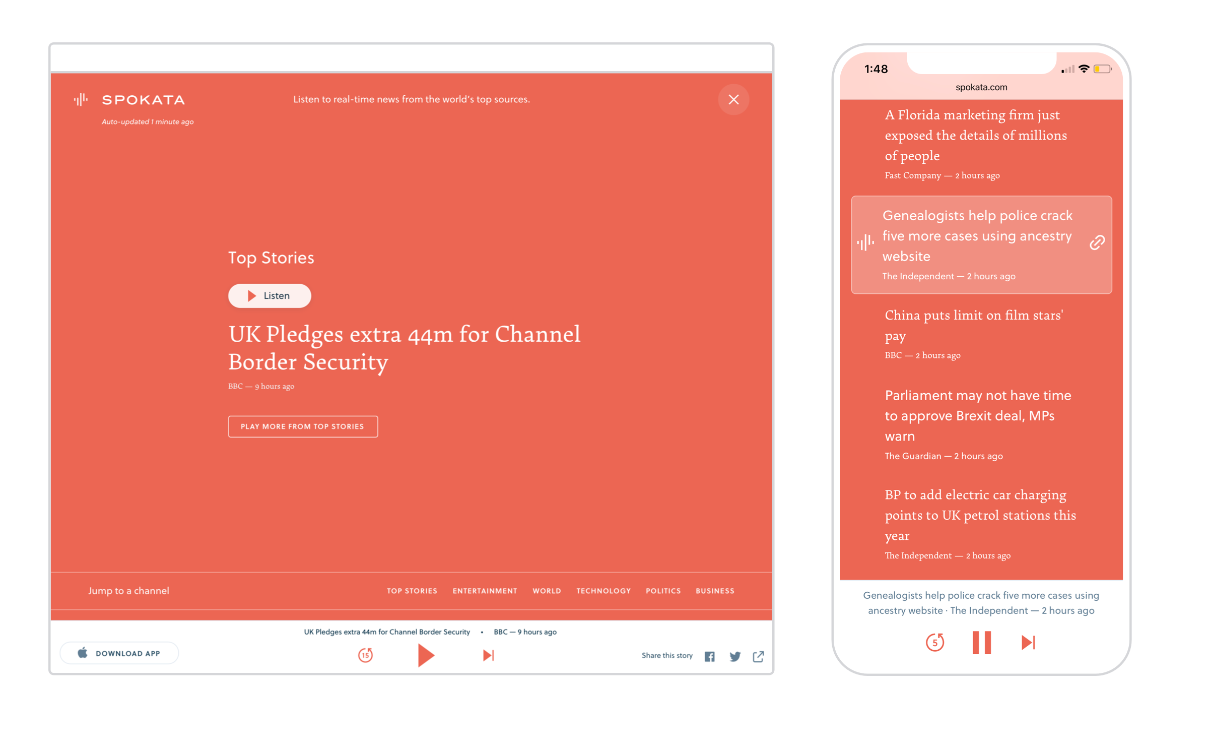
The front page
Similar to a newspaper, the front page shows summaries of stories from each channel (Top Stories, Business, Technology, World, Entertainment, and Technology).
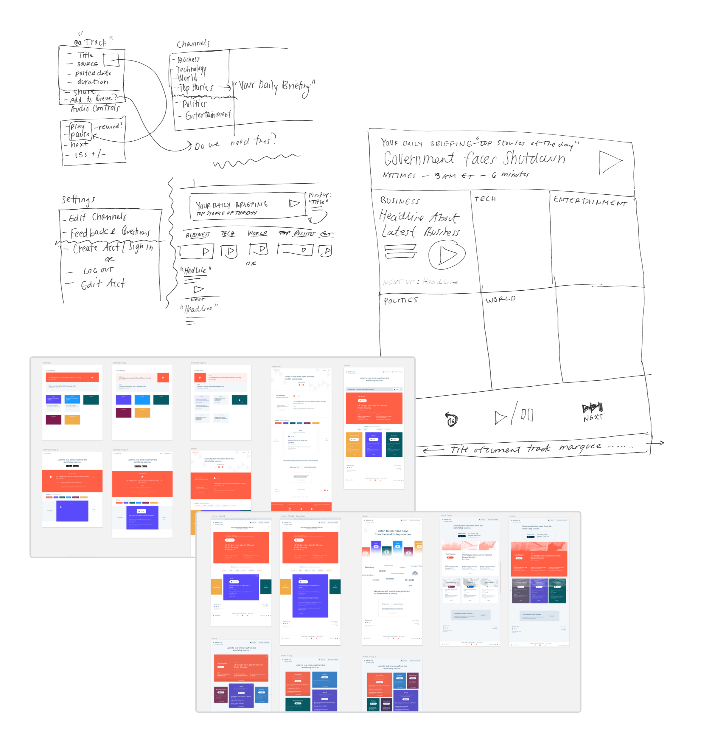
For layout, I experimented with a lot of carousels, cards, channels navs, and horizontal pagination. But based on feedback, we ended up ditching complexity in favor of a simple card for each channel.
In the end, this view:
- Allows me to see all channels and preview its content without having to click through a carousel of channels
- Avoids the need for a second channel nav (in addition to the site nav)
- Gives me a clear interaction pattern — tap to expand a channel, move left and right through channels, dismiss back to the front page
Good for thumbs
A fixed playbar at the bottom of the viewport makes listening feel native and natural, no matter the screen size.

“We’ll do it live!”
(Well. Technically in staging.)
My favorite projects involve close communication with developers. From the outset of this one, we iterated on the live site in staging — testing and making adjustments if things felt off.
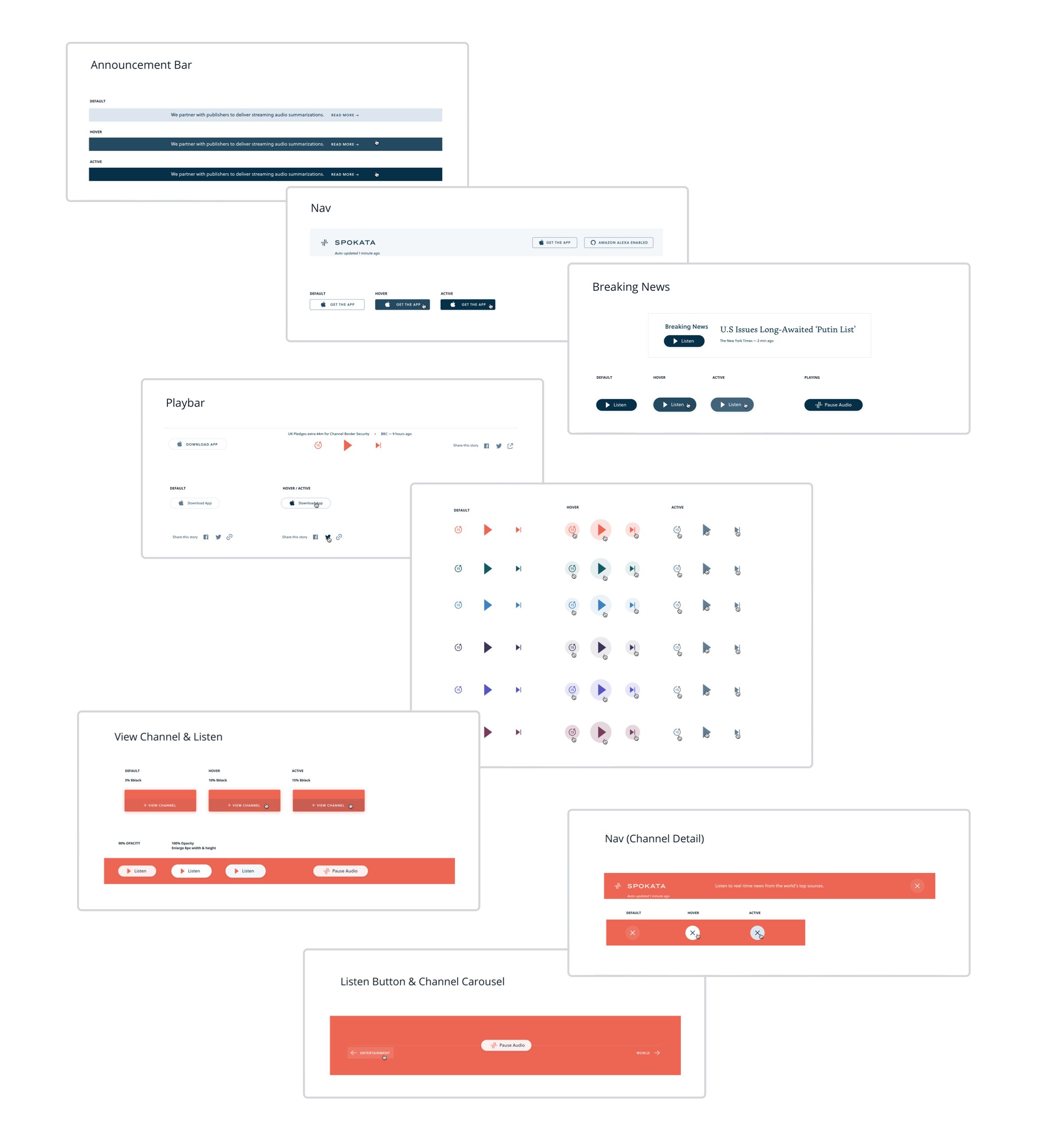
We used a combination of Trello, Invision sync, Sketch redlines, and some live tweaking over the phone to prototype and QA the site. As things changed, I made necessary updates to our library of components in Sketch.
Identity
Video and audio play more and more of a role in the way we consume news. It was important the Spokata brand feel fun and interactive, but also trustworthy.
I cleaned up the logotype and created a Spokata logomark, which also serves the ‘playing’ icon. The typography has two families — Arek Latin and Soleil — a serif and sans serif alternated throughout headlines as a nod to classic newspaper typography.

The stack
The site was built in React, using the Ether design library — h/t to Jackson Latka and Matt Staff on technical strategy and implementation.
Check it out: spokata.com︎
Product Strategy Jackson Latka
Development Matt Staff